"How effective is the combination of your
main product and ancillary texts?
I think that our ancillary texts fit well with our music genre. Our poster and digipak convey the house music genre as you can see from the pictures that we have one main protagonist and that our video is set in a very urban setting. We stayed with our black and white theme throughout the video and portrayed this onto the poster and photos within the digipak. We felt that this made it very simple but effective. The black background contrasts with the lightened picture and bold writing and makes the poster very eye catching.
when regarding our
digipak, a main influence was Rhianna’s ‘Good girl gone bad’ album. We tried to
make our cd look very simple but effective and her album showed exactly what we
were thinking of.
 As you can see, the style of the CD is very plain and simple but extremely effective. We stuck with our theme of black and white with our CD cover and I believe that it came across very well.

The process of making our CD took a while. There were a lot of things we had to do. First we were given a template and to then decide what we wanted involved. So we trialled some of our location shot photos. These went into the background. This meant that we now needed to make a CD that would be suitable for the song, genre and to the audience's taste. Once t hey had both been put together, we knew that this looked right and really showed off the urban vibe.


The process of making our CD took a while. There were a lot of things we had to do. First we were given a template and to then decide what we wanted involved. So we trialled some of our location shot photos. These went into the background. This meant that we now needed to make a CD that would be suitable for the song, genre and to the audience's taste. Once t hey had both been put together, we knew that this looked right and really showed off the urban vibe.


When branding our video, we wanted to make it look like an old black and white silent movie. We wanted to add effect to this by using subtitles during our music video and we also used a countdown which are still sometimes used in music videos today. (Eminem 'Without you')

Our influences were the classic film noir styles. These being black and white movies with little or no dialogue and heavily reliant on mise en scene. We were very much inspired by the likes of Charlie Chaplin and directors such as Hitchcock.


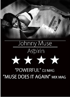
Regarding our magazine
advert the branding elements of our media product followed through in that
again black and white as dominant colours with simple white font styles and
text which replicates subtitles in our video and old movies. We also used key shots from our video as the
main image on the poster. When making our poster we made up quotes from real life music magazines such as DJ Mag and Mix Mag which were also hugely influential to our music choice.

Standard codes and
conventions of magazine adverts would be that thy would sow the artist in the
picture as they are advertising their product and themselves as a brand like Richard
Star’s theory but as our song is in the house genre the dj isn’t usually featuring in the video or on the posters which
observes the codes and conventions of house music.
Also, another part of making our video, digipak and magazine advert was deciding what was to go into our initial idea. By doing this we made a 'wordle' which contains all the words we thought would associate with our music video. We then used some of these words to influence us in our decisions later on in the making process.


When making our magazine advert we sampled a lot of pictures and settled on the main picture of our character laying in the cardboard box. This was our small storyboard of pictures we used to determine our ideas upon.

Once we had chosen our picture we then had to use Photoshop to make it look perfect. This took a lot of 'Trial and Error' to see what we thought looked good. First of all we had to make the photo black and white. To try to give it a gritty feel we had to use a spray paint tool. We then added it to a black background and smudged the edges so it blended in unnoticeable. We then had to trial different font types to get the perfect one. We always stuck with the black and white theme so it didn't prove too difficult for us. Next we added quotes and star ratings to make it look professional and realistic. Then finally adding the last touches of a bar code, the record label and iTunes symbol purely for 'potential buyers' of the song. This all added to the realism of the magazine advert and helped it to look professional and acceptable.


 Also, when making our digipak's back cover we wanted a simple picture to display at the back. The picture we used was of an underground station that was used in location in the music video. We also edited the photo ourselves and made every possible use of writing spaces letting the audience know what they are receiving.
An initial idea was to use some sort of graffiti as we were going for the 'urban/rural' vibe. We found a website where we could create our own. We added it to the back cover and started to work around it. But in the end we went in a different direction. We just didn't think it gave the right look or feel to the CD cover itself and so we went against it and stuck to a much simpler look.


 The pictures below are all used to make our Digipak and magazine advert look like the real thing. We added logos such as the record label of the song we used '2MR2 Records'. We also used a barcode that we created and also the new barcode you find on smartphones. As well with our magazine advert we added the famous Apple icon to show the audience that the track is available to download on iTunes. These features were added to make the product look as realistic as we could make it.


.png)

.png)
.png)
Please visit my multimedia evaluation on Wix.
http://www.wix.com/guazzellialex/eval


The underground designs go with our potential album cover pictures. We originally wanted a photograph of an underground station. We found a large colourful picture that we were happy to use. We had to Photoshop the picture to deleted the writing and to add our own. We then had to make the picture black and white to stick with our black and white theme. We also researched the underground font and after a long time of trying finally found the perfect match. We used those letters found and pasted t hem onto the blank space available to spell out the artists name. Unfortunately we didn't have room to write the name of the song on the sign as well so in the end we decided to go in a different direction.


An initial idea was to use some sort of graffiti as we were going for the 'urban/rural' vibe. We found a website where we could create our own. We added it to the back cover and started to work around it. But in the end we went in a different direction. We just didn't think it gave the right look or feel to the CD cover itself and so we went against it and stuck to a much simpler look.


 The pictures below are all used to make our Digipak and magazine advert look like the real thing. We added logos such as the record label of the song we used '2MR2 Records'. We also used a barcode that we created and also the new barcode you find on smartphones. As well with our magazine advert we added the famous Apple icon to show the audience that the track is available to download on iTunes. These features were added to make the product look as realistic as we could make it.
.png)
Please visit my multimedia evaluation on Wix.
http://www.wix.com/guazzellialex/eval
No comments:
Post a Comment